
Praxis ACG Rebrand Case Study
Praxis:
Re-Brand
Re-Position Re-Excite!
Project Overview
Praxis boasts of a one of a kind platform that gives their partners access to carriers in every vertical market. They are a member-driven producer group for insurance agents, financial professionals, agency owners, recruiters, and IMOs. They also offer marketing assistance for all their members. They were looking to re-position their company as the high-quality brand it is. They wanted to give their members & partners a brand they could be proud to be a part of.
This is where BlueRocket came in.
Expertise
Logo Design
Brand Strategy
Brand Development
Brand Identity Design
Website Design
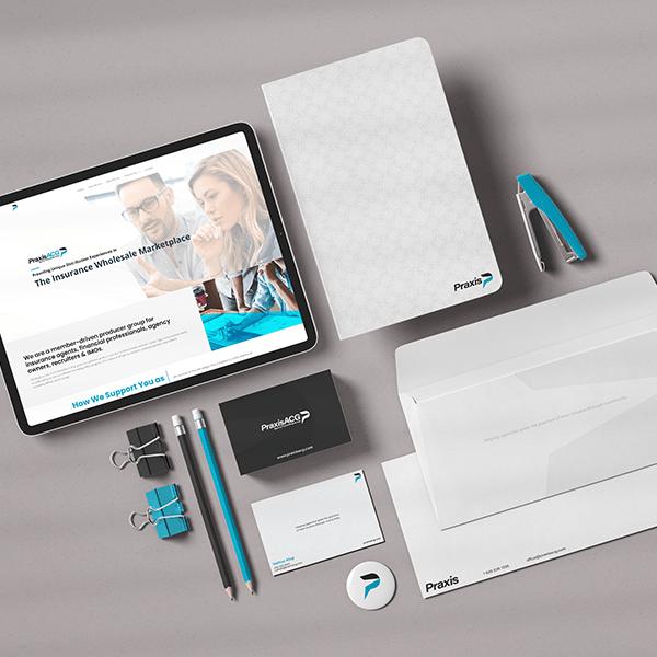
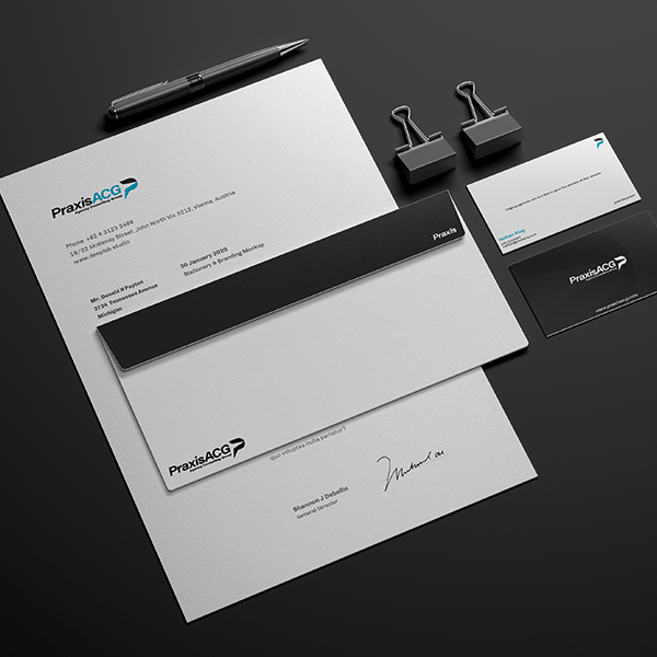
Deliverables
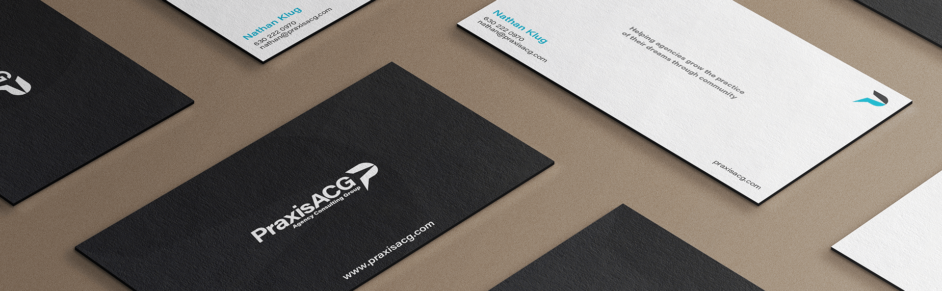
Logo Icon
Logo Mark
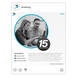
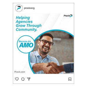
Templates
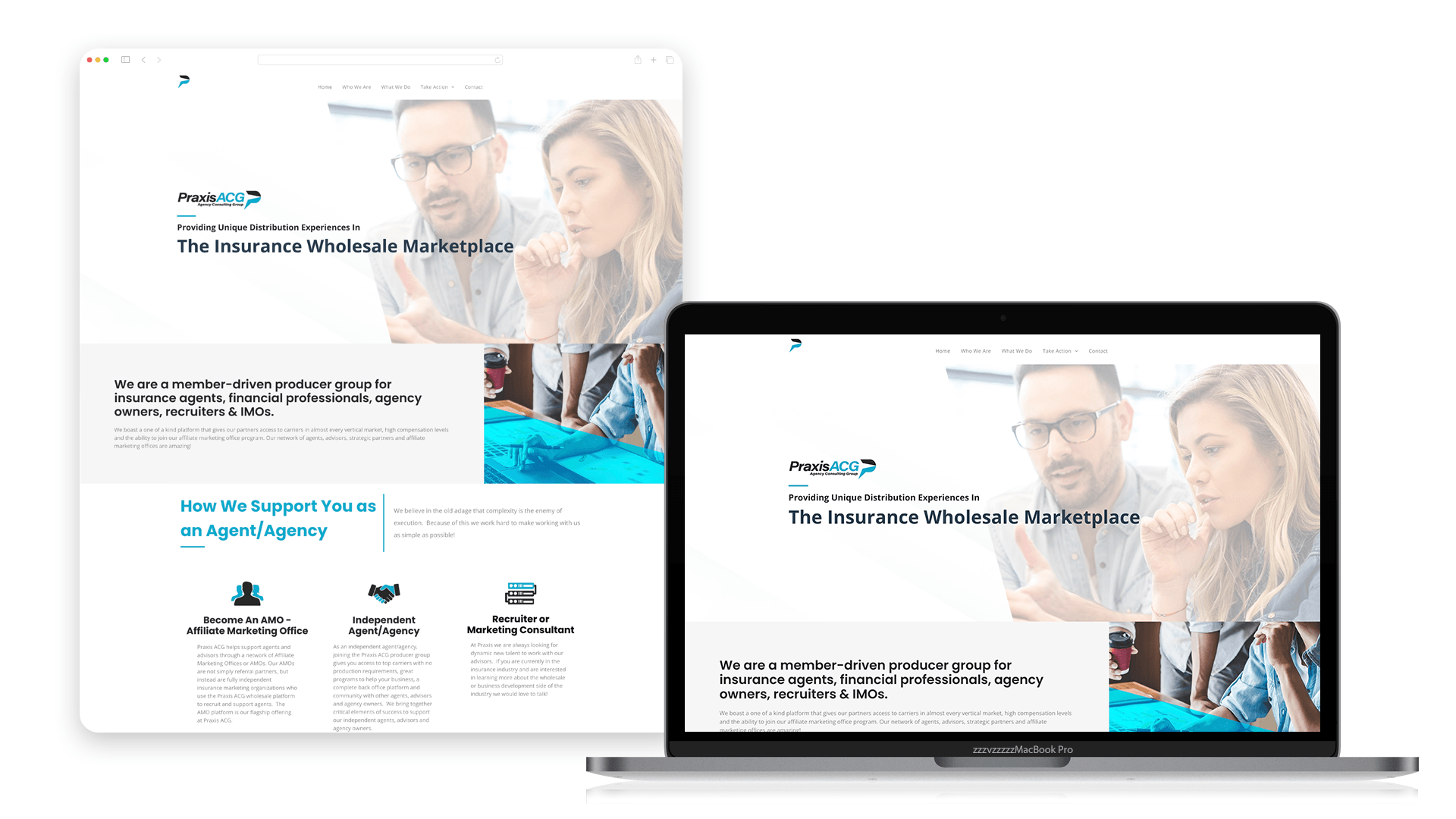
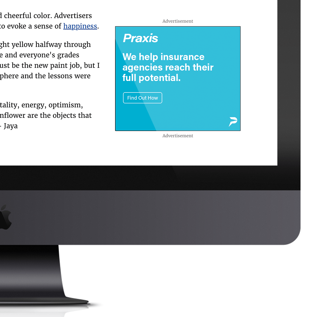
Website
SEO
Visual Identity
Creative Messaging
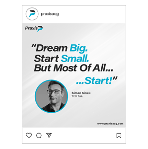
Brand Voice
Brand Mission
Brand Vision
Brand Voice
Brand Strategy
“We were so excited and proud of the brand that BlueRocket created for our team!
Our members & partners will be excited about our rebrand!"
Nathan Klug
Managing Partner at Praxis

About Praxis
Praxis is a dynamic team of industry professionals with a mission to support agents and agency growth.
The Partners at Praxis ACG have been providing integrated wholesale support and marketing solutions to insurance professionals and agencies for over 15 years. Praxis brings out-of-the-box thinking, creative execution, and professional excellence to every agent and agency they support. They also invest their full attention to the understanding of their members needs. Believing that insurance agents play a vital role they know the importance of meeting them where they are at to ensure helping the end user Is successful.
The Outcome
The process began with our initial brand review and survey. In our initial meeting we learned the obstacle Praxis was looking to overcome. They wanted to re-position their company through a more professionally designed and strategized brand. We also discussed their mission, vision, and brand ideals to find out if their current branding was representing what they stood for as a company.
Working directly with the owners helped us understand the direction they were looking to take the products/services they offered – this vital information helped us begin the process of their brand strategy. The team also gave us a clear overview of who their target audience was and what their needs and goals were.
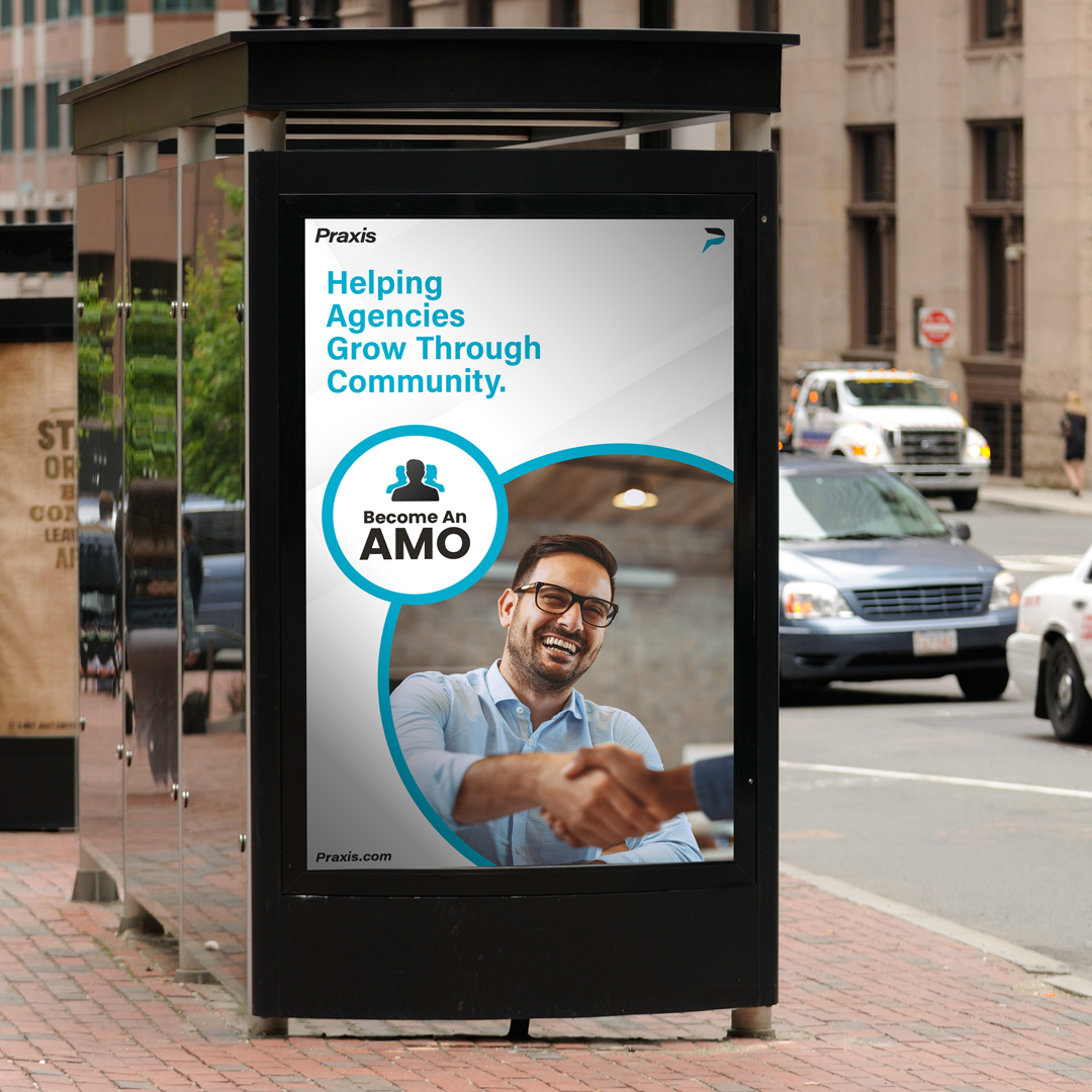
Praxis is a company that supports others in their business journey and growth. We wanted this brand ideal to be showcased in the visual identity. Our end goal was for Praxis to feel like the approachable leader it was. Every element of the brand had to show growth and empowerment — the logo, colors, shapes, layouts, and creative messages.
Internal Branding
—
Mission Statement
Helping agencies grow the practice of their dreams through community.
Brand Values
- Serve Others with Our Intent, Actions, Work & Time.
- Create a Culture of Transparency & Respect
- Act With Integrity in Everything We Do
- Affect Change Through Partnership, Relationship, and Education
Brand Voice
The Everyman Archetype
Friendly // Humble // Authentic
Praxis Is all about guidance and education for its members, but more importantly they are about supporting them. The brand voice is welcoming and inclusive. Praxis is building a community where everyone will have success.
Old Logo
New Logo
We knew early on we wanted the logo and word-mark to convey movement. This symbolizes the promise Praxis makes with its members & partners to assist them in progressing their success. We achieved this by adding a slant to the word-mark and implementing an arrow within the Praxis icon.
Color Palette
—
Primary Colors // White & Praxis Black
Secondary Color // Praxis Blue


When it came to the color palette we believed It was necessary for the brand to feel accessible and welcoming — without losing its professionalism. To achieve this we decided to make the primary colors white and black. White will accomplish this purpose by making the brand feel open and approachable.
The secondary color is a steel blue — the most naturally occurring color in nature. This gives a sense of trust.

Shapes // Circles & Rounded Edges
This gives a sense of community, safety, and integrity.
Typography
—
Friendly
Professional
Authentic
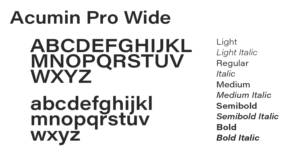
We went with a traditional and classical typeface. A San Serif font conveys simplicity and minimalism. They come off friendly — welcoming. Acumin brings a subtle touch of humanity to the brand through type.
Media & Touchpoints
—
Request
A Free Quote
Work with our team to elevate your branding and marketing campaigns!