Red Oak Risk Management Case Study
Red Oak:
More Than
Insurance.
Project Overview
Red Oak is a Chicagoland insurance company thats passionate about protecting families through proper risk management and financial education.
They offer full-service multiline insurance & financial planning. They promise to help find the best possible solutions for families & businesses. Helping their clients in every area of their financial lives, while conveying a deep commitment through education, proactive planning, and great service.
Although, being a positive and highly knowledgable company is great, it’s always complicated entering into a crowded marketplace as the new guys on the block. This is where BlueRocket came in.
Expertise
Logo Design
Brand Strategy
Brand Development
Brand Identity Design
Website Design
Marketing Campaign
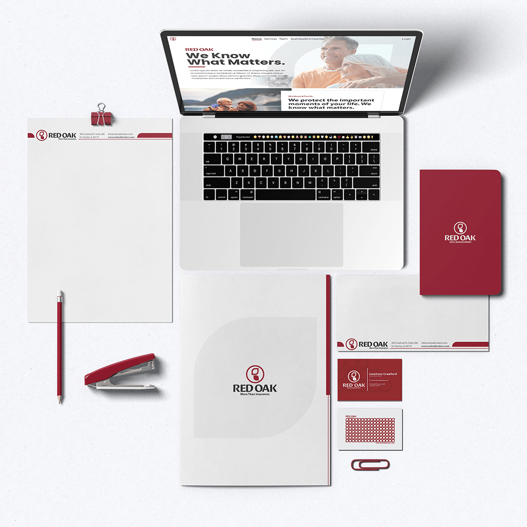
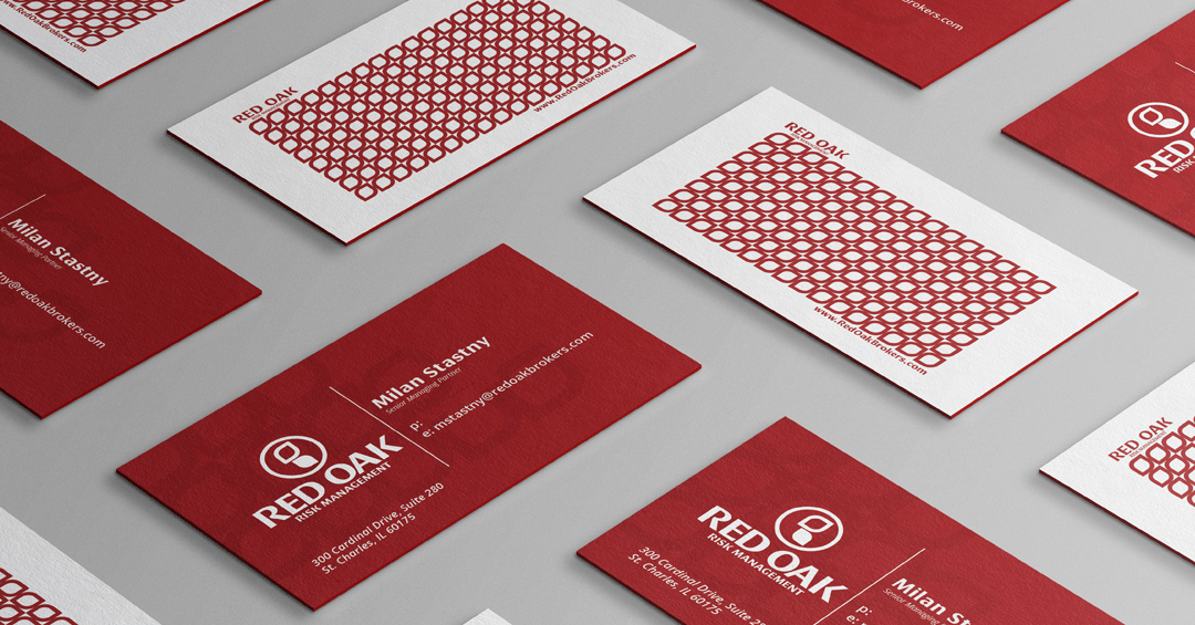
Deliverables
Logo Icon
Logo Mark
Templates
Website
SEO
Visual Identity
Creative Messaging
Brand Voice
Brand Mission
Brand Vision
Brand Voice
Brand Strategy
“We love the Identity that BlueRocket created for our brand!
We know this will help our company stand out amongst our competitors!"
Milan Stastny
Managing Partner at Red Oak
The Outcome
BlueRocket started exploratory discussions with the owners of Red Oak. We discussed the brand name, Red Oak, and why it was chosen. It symbolizes strength, patience, and growth.
Our conversations helped us to harness the positive energy within the team and how Red Oak was setting out to be different from other insurance companies.
We built up a picture of a business that cared about helping people and guiding them through a stressful process. We attended one of the Red Oak meeting and learned they ended each time with “Let’s go help people”. We knew here that we wanted to create a brand personality focused around this core value — helping people. Echoing the teams desire to create a safe environment for their customers and clients.
Internal Branding
—
Mission Statement
Helping protect what matters – one person at a time.
Brand Values
Serve others with our intent, actions, work and time.
—
Create a culture of transparency, dignity and respect.
—
Act with integrity with everything we do.
—
Affect change though education, protection and proper planning.
—
Brand Voice
The Caregiver
Bold // Honest // Reassuring
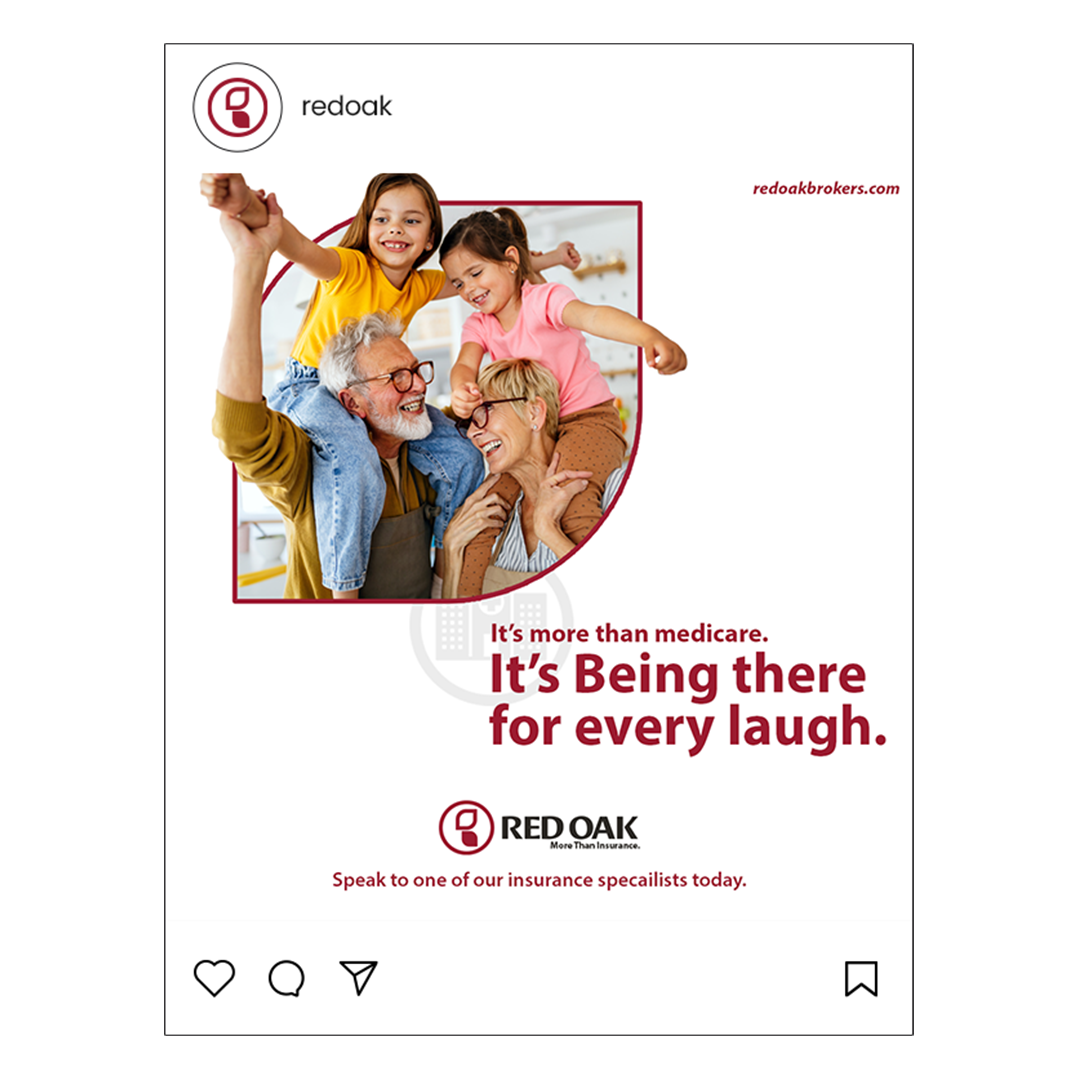
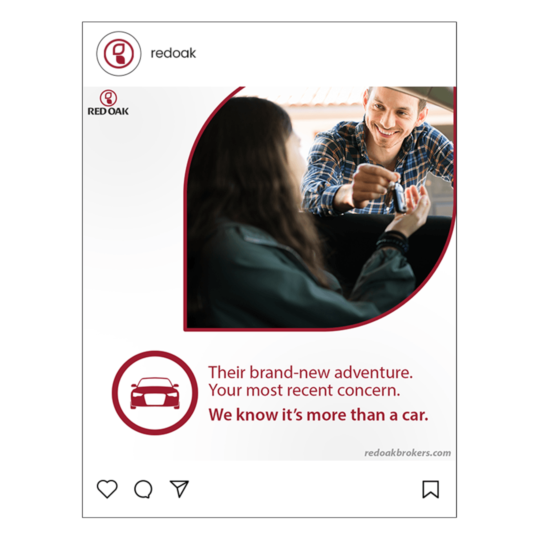
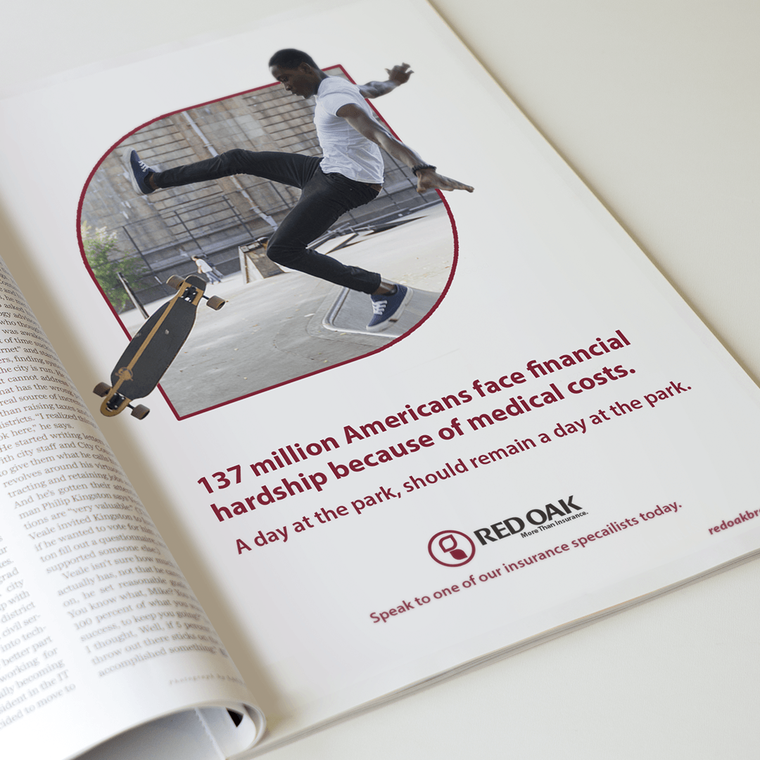
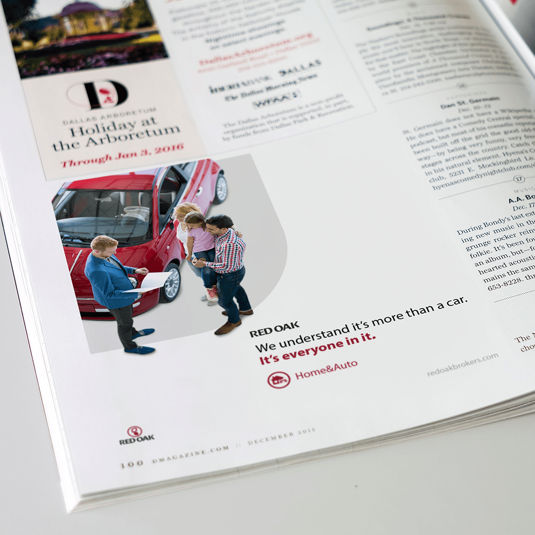
Red Oak offers more than insurance for their customers, they guide and support them. The brand voice is clear, direct, but warm and caring. Red Oak understand It's more than insurance and finance.
Logo Design
We knew we wanted the logo to feel modern and clean. We used two minimalistic leaves to create the "R" within the "O". This symbolizes how Red Oak will cover the leaves of your life — family members, assets, investments etc.
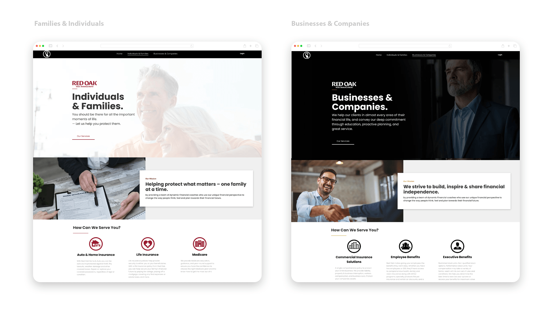
Iconography
For the Icons we used the circle from the logo symbolizing Red Oaks coverage of each asset. With the Family & Individual side we stayed with red, but went with black on the Business & Company side of the brand.
Typography
—
Humanist
Professional
Authentic
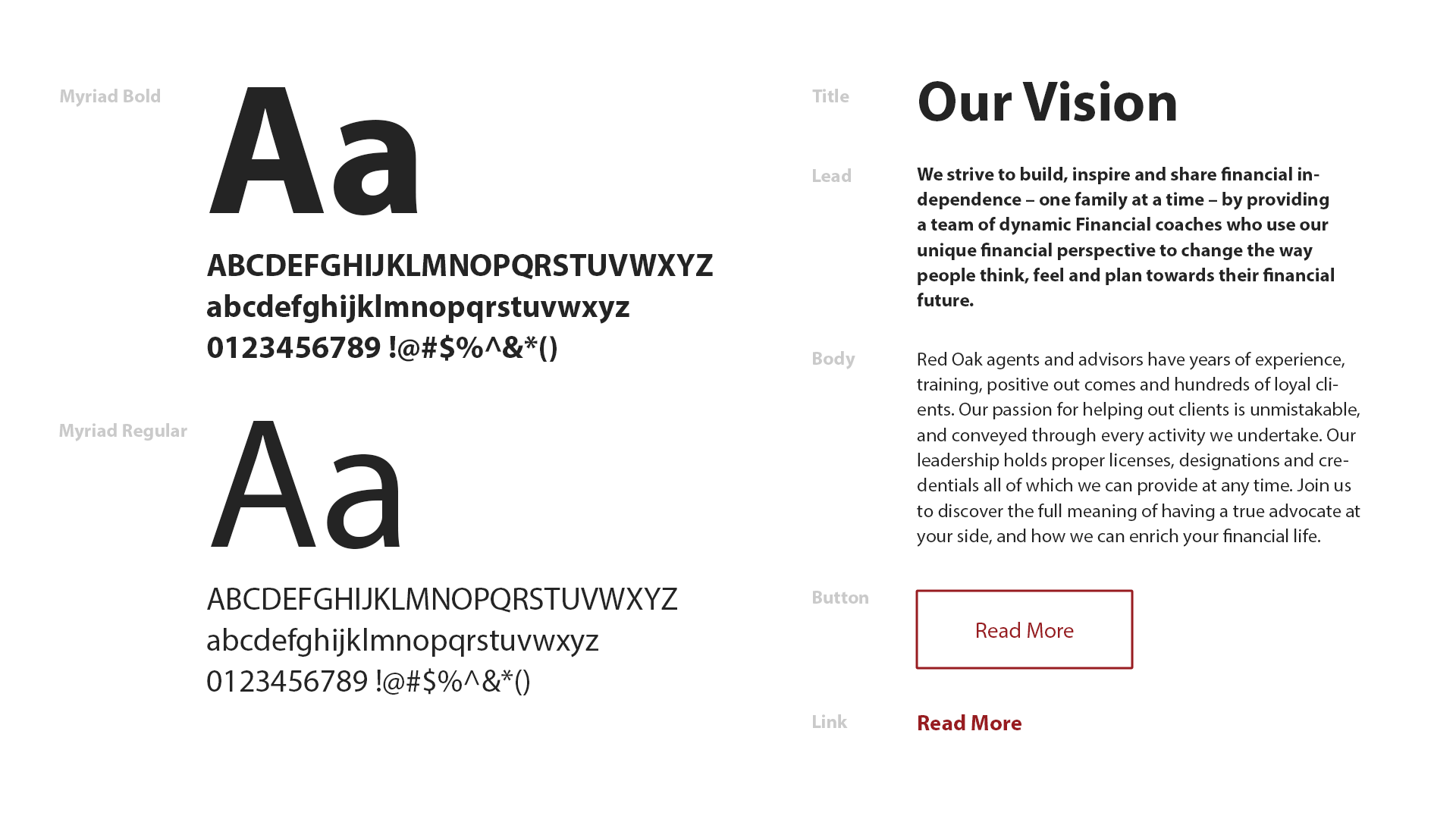
We went with a traditional and classical typeface. A San Serif font conveys simplicity and minimalism. They come off friendly — welcoming. Myriad brings a subtle touch of humanity to the brand.
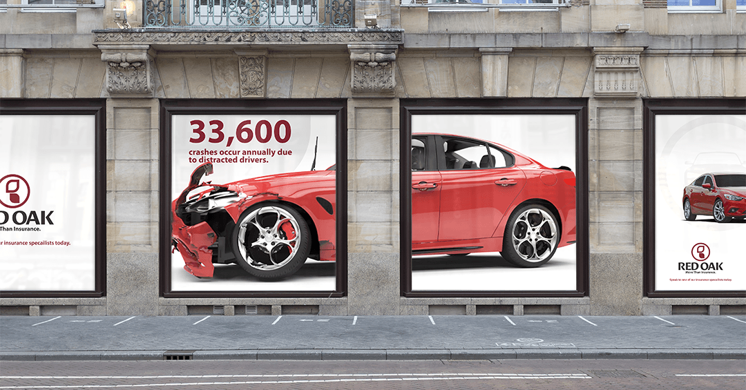
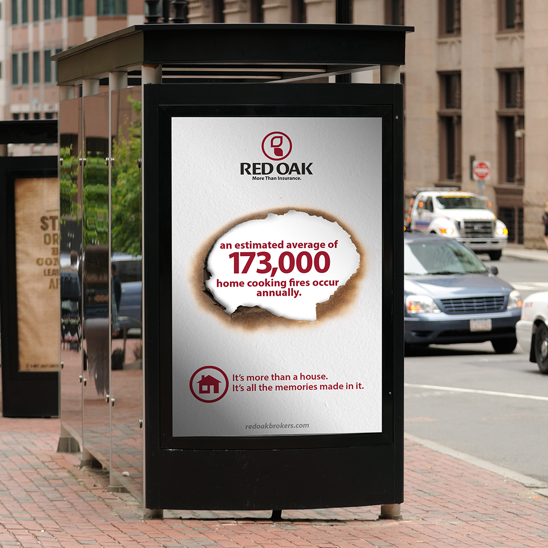
Media & Touchpoints
—

Request
A Free Quote
Work with our team to elevate your branding and marketing campaigns!